How to build a Mobile Site
Examples
How To
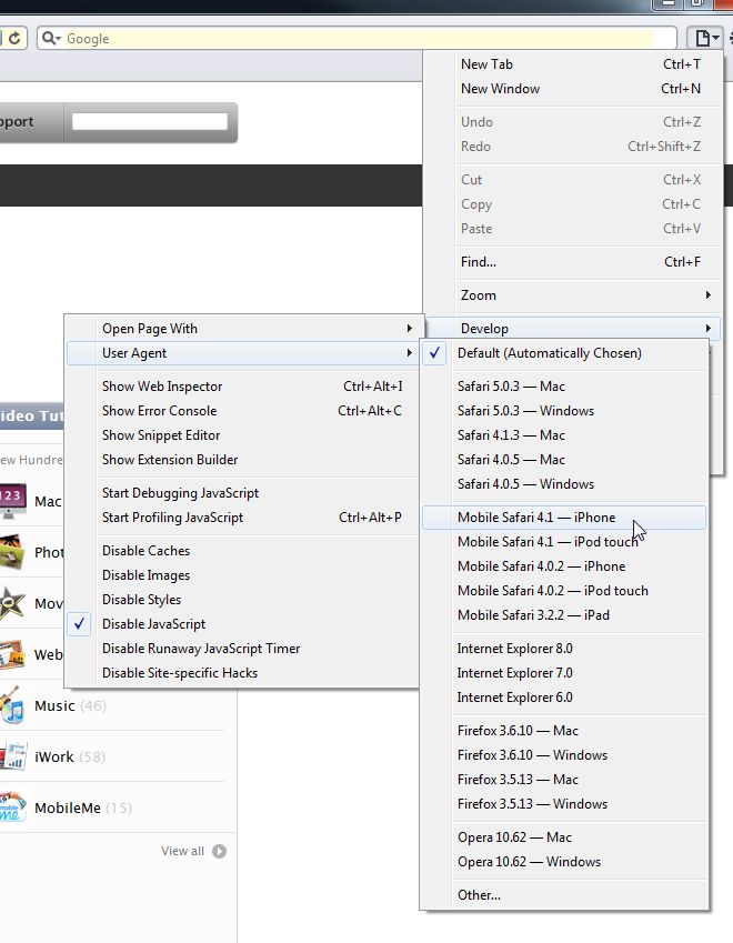
Through creating a mobile site, you can test how it is going to look by using the safari mobile user agent. See below.
Any questions you have feel free to ask Shmal.
- Copy the mobile layout code from one of the example sites above and paste it into the mobile layout version of your site.
- Add a mobile.css stylesheet; copy and paste the css from one of the sites above.
- Edit your mobile.css styles to reflect the colors of your site.
- Create the template for your mobile site. You can copy the modules from one of the example sites above.
- Make a scaled down logo that will fit in the header module.
- Make a page selected or specific page down page menu. If you make a specific page down menu, make a page called mobile and put links as sub pages under it that point to the pages you want to show up on the mobile design. This way is nice because the client or Marketing Manager can add more links under here any time they want to add a page to the design. Raxenburg is a perfect example of this.
- Using the Switch to Mobile and Switch to Standard buttons under Editing Content, Add shorter content to the mobile pages based of the standard pages, and remove any links from them that directs to pages not on the mobile design.
- Test on an iPhone
Phone Link Tutorial: raizlabs.com/blog/202/iphone-telephone-hyperlinks
To create background gradients for your buttons, check out this article:
webdesignerwall.com/tutorials/cross-browser-css-gradient
Theory
Why Div's for the layout? They are best for a site that needs to expand and condense based on a persons device. Since there are so many different screen/resoultion sizes out there, you need to be able to have the mobile site be any size.
This is also why you want to create a 1px image for the buttons that can repeat horizontally, or simply a background color with perhaps a border bottom on them.
With mobile sites it's all about simplicity and fluidity.
Set Safari to Mobile User Agent